Key Takeaways:
- Most salon website designs miss the point: your site should book appointments instead of simply looking pretty.
- Clear messaging, strong CTAs, and seamless online booking turn website visitors into real leads.
- Adding tools like Mya’s salon client matching tool personalizes your site and boosts conversions.
Most salon websites look pretty good on a superficial level, but others founder when it comes to turning visitors into booked clients. If potential clients land on your website, fail to find the right information or a clear method for booking appointments, they'll bail and seek out a competitor.
With more than half of clients now searching for services online and on mobile devices, scheduling services outside of normal business hours, your salon website design is either pulling double time for your business or costing you bookings daily.
This guide will walk you through how to design a salon website that converts by focusing on the right details, such as first impressions, clear messaging, strong CTAs, trustworthy social proof, online booking, and built-in smart lead capture.
We'll look at practical website conversion optimization steps that salon businesses can take, whether you're starting from beauty salon website templates, a WordPress site, or a custom build. As you read, pull your own site up on your smartphone and review these sections as if you are a potential client seeing the site for the first time.
You Have About Three Seconds to Make a Visitor Want to Stay
If a new visitor lands on your salon website, they form an opinion of your business in about 3 seconds. Research on website design and user behavior shows that layout, visual appeal, and clarity of information are the driving forces behind these snap judgments well before the potential client skims through a full service page or blog post.
For a beauty or service salon, this means that your above-the-fold area has to work hard. It's where potential clients decide whether they are intrigued enough to continue scrolling or ready to check out another site.
Aim for a clean, professional web design for your salon that instantly answers three questions: who you are, what services you offer, and where you are located. Your "hero" section should include a simple headline that presents your brand's personality, front and center. It should have a subheading that mentions your key services or hair services, and a clear CTA for salon website visitors.
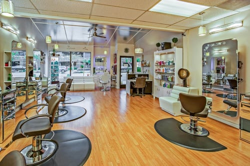
Combine this with real photography, not AI-generated or generic beauty salon website templates with stock images. Think in terms of before-and-after photos of your work, your team, and your salon's vibe. This will build the all-important trust factor much faster than a slogan or generic pics.
To keep the entire experience user-friendly, avoid too much clutter on any given page. Avoid fonts that are difficult to read and slow-loading sliders on your homepage. Make sure your business hours, high-level service menus, and contact details are easy to find without scrolling through several pages.
When you design this top section, consider it your digital front door. A good salon makes a client feel welcome and at home away from home, and your site should do the same at a minimum. Over time, you can test small changes without the layout, imagery, and wording to improve website visitors' engagement and keep more business on your site instead of losing it to competitors.
Most of Your Clients Are Finding You on Their Phone: Is Your Site Ready?
For salons and other service businesses, mobile devices are now the primary method new clients use to search for services online. While your desktop design is important, your mobile experience is where your salon website design either wins leads or loses them.
A mobile-friendly beauty salon website should load fast, resize beautifully on different screens, and never force users to pinch or zoom just to read basic information. Buttons and tap targets should be large enough for thumbs, text should be comfortably readable, and the core navigation experience should remain simple.
The "Book Now" or "Schedule Appointments" buttons need to be visible without scrolling, because allowing clients to act in the moment is one of the key features of a high-converting website design.
From the standpoint of search engine optimization (SEO), mobile performance matters. Search engines like Google favor mobile-friendly sites in local search results, especially for "near me" queries from people looking for services to try in their city.
This means a responsive site with good technical knowledge behind it (fast speed, compressed images, and clean code) can help your salon website push towards a higher position when potential clients search for specific services.
Test your site on your own smartphone. Don't use a laptop or desktop preview or website builder simulator. Walk through it like you're a new visitor. Can you see what the salon offers, where it's located, and how to book in under 30 seconds? If not, you have work to do.
If Visitors Have to Hunt for Your Book Now Button, You Are Losing Leads
On any salon website, the call to action (CTA) is the bridge between browsing and becoming a lead. The most beautiful beauty salon website templates in the world will not help if your "Book Now" button is buried, vague, or competing with five other actions. A strong CTA for salon website visitors should be clear, specific, and impossible to miss.
A high-converting website design typically places a primary CTA in 3 places: In the header navigation on every page, in the hero section above the fold, and again after key sections, such as your main service pages or pricing overviews. Instead of using a generic button like "Learn More" or "Click Here," experiment with specific CTAs like "Schedule a Cut and Style" or "Find Your Stylist Match."
Design details are more important than some realize. Use color contrast so the CTA stands out against your background, leave enough white space around the button so it isn't crowded by text, and keep your secondary links (social media icons or spa add-on details) visually separate.
One primary CTA per page tends to convert better than 5 competing options because it reduces decision fatigue. As you refine your salon website design, think about each page as a single, primary job. For instance, your homepage is to get visitors into your booking flow or your Mya matchmaker flow. The last thing you want is for your homepage to send clients down a rabbit hole of unrelated content.
New Clients Need to Trust You Before They Will Book With You
Whenever a new visitor lands on your hair salon website, their greatest unknown question is a fairly simple one. Will I be in good hands here? A good salon will answer that question through immediate visual appeal, clear info top to bottom, and social proof.
Start with real photos that show your team, your space, and an extensive range of your work. Before and after photos of different services (cuts, colors, extensions, texture services, and more) help potential clients picture themselves as one of your satisfied clients.
Short team bios with headshots and specialties turn anonymous staff into approachable professionals and help retain clients who feel connected to a specific stylist. Including a section with Google reviews highlights or quotes from happy clients provides additional social proof and reassures visitors that your salon business delivers on its promises.
This is also where a salon client matching tool provides a significant conversion asset. By placing a matchmaker on your site, usually linked from your homepage or service pages, you provide new clients with a simple quiz that matches them with the stylists who best fit their hair, personality, and budgets.
Visitors Who Cannot Book Instantly Will Book Somewhere Else
The moment a visitor decides they are ready to book is the most important moment for your site. Unfortunately, if the process is convoluted, slow, or kicks them out to a third-party site, many of those potential customers will see themselves to the door.
Ideally, your salon software or online booking integration for salons is embedded directly into your site, either as a pop-up module or an on-page form that keeps your branding intact. This way, allowing clients to choose services, pick a stylist, and confirm a time feels like part of your site and not a handoff to some unknown platform.
Keep the number of required fields as low as possible (name, contact details, preferred service, and stylist), and use automated reminders in your booking system to confirm appointments and reduce no-shows without extra work for you or your team.
The Best Salon Websites Do More Than Look Good — They Qualify Visitors
A traditional beauty business website acts like a digital brochure. It lists services, shows some photos, and provides basic contact information. A high-converting salon website, on the other hand, acts like an automated tool for lead qualification. It helps potential clients figure out which services they need, which stylist is the right fit, and how to move forward without requiring you to answer every question one-on-one.
Well-structured service pages are your best starting point. Instead of dumping every service into a single, long list, break your hair services and spa offerings into clear categories with short descriptions, expected timing, and who each service is best for.
This is a kind of engaging content that helps visitors self-select the right option and reduces the chance of mismatched bookings. You can also add answers to frequently asked questions (FAQs), such as how often to book color services, what to expect at a first visit, or which beauty products you recommend, to support both SEO and client education.
Adding a salon client matching tool takes this process a step further. If visitors are encouraged to "Find Your Stylist Match" or "Take the Matchmaker Quiz" on your site, they are becoming leads, but they are also becoming qualified leads with clear preferences and expectations.
The data from the quiz flows into your client records, offering you more relevant information for future marketing tools like email follow-ups or personalized offers. In practice, this means your salon website is not only attracting more clients online, but it is also helping you match the right clients to the right professionals. In turn, this will help you build a healthier book over time.
Your Website Should Work as Hard as Your Best Stylist
When you look at a salon website design through the lens of conversion, the priorities become much clearer. A strong site is not just about visual appeal or having the trendiest beauty salon site or online store. It's about how quickly visitors understand who you are, how easy it is to book, and how confident they feel about choosing your team.
The salons that are winning online aren't always the ones with the fanciest effects or the most tech-savvy setups. They are the ones who treat their sites like a living part of their business. They refine first impressions, bolster mobile performance, offer specific advice, clarify their CTAs, showcase real social proof, tighten their online booking, and use tools like Mya to qualify leads instead of just collecting them.
If you want your site to function as a true lead-generation engine, it's time to add a personalized matching layer on top of your existing booking flow. Mya was built specifically for beauty business owners who want their sites to match new clients with the right stylist and then guide them into booking on the spot.
To see a working example and talk through how it could fit into your salon website, book a demo with our team!


Comments
0 Comments